

.png)
Sign Up is often the first interaction a user has with your product. This entry point experience is an important moment in establishing your product’s brand and experience and sets the tone for their overall experience with the product. To ensure your user’s experience is seamless from the beginning, you should design your sign-up screen to be as intuitive and friendly as possible. These tips will help you create an impactful sign-up form that gets you closer to your desired result: more leads. These tips come from a long study of popular products and current UX research.
What is the sign-up form?
A signup form is a web page, popup, or modal where users enter the information required to access that website’s services. The information collected is determined by the nature of the website and the services it offers. Most signup forms require a name, email address, username, and password. In UX design, the sign-up page is the gateway to your product. If designed poorly, it could negatively affect your user experience and discourage visitors from trying your product.
What is the purpose of a sign-up form?
Sign-up forms can have multiple purposes, but typically share a common goal: acquire personal consumer information, such as their name and email, in exchange for access to top-notch information or services. For many products, sign-up forms can also represent the entry point that makes all further conversions possible.
Why does sign-up page design matter?
It marks the start of your user onboarding process, which directly impacts user activation. They’re designed to make website visitors comfortable enough to sign-up for your product. Signup pages set the tone and establish your brand as a professional, trustworthy business. It creates an amazing first-time user experience and provides an opportunity to show potential customers the benefits of your product.
1. Split up the registration process.
Keep your form simple and easy to fill out. Give the user a choice and it will allow the user to create an account quickly and comfortably. Why fill out long forms when you can register with a couple of clicks? First, you should avoid providing any extra controls in the registration process by focusing on the necessary information only. Still, if there is more information that can be grouped logically, you can go towards a multi-step form. Today, consumers don’t expect highly complex login forms that are too confusing and time-consuming. They don’t want to take the trouble of filling out long forms that take too long. The best sign-up page design is one that presents users with multiple sign-up options so that users don’t get frustrated and have the chance to choose.

2. Keep the sign-up form as short as possible.
When it comes to sign-up forms, the more fields, the less likely a person is to want to complete the form. In fact, in one instance, less fields can lead to a 120% increase in conversions. [Resource] Avoid asking for too much information when the user signs up. Life is too short to spend it filling out forms. Ask only for essential information. Many websites or apps may ask for a ton of information as part of the qualification process. However, the best sign-up forms are always clean and simple to minimize friction. Ideally, your form should only ask for the information that’s absolutely necessary to register the customer in your database, such as their name, password, and email address. Of course, depending on your industry, you may need to collect more information than that, but try your best to make the form as short and simple as it possibly can be, and you’ll dramatically increase your conversion rates. It’d be best to save your users the hassle of carving out a username for your website. Instead, you should offer options to register with their phone numbers or email addresses.

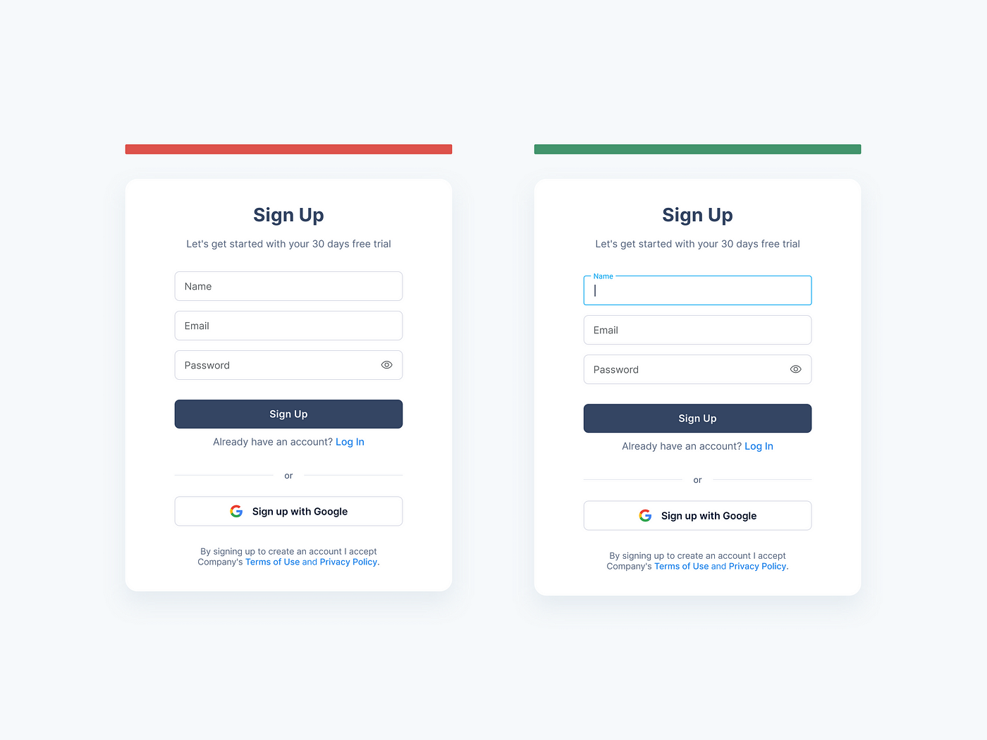
3. Autofocus on the first field.
Chances are that most of the people accessing your registration form will quickly click on the first input. The trick is to forestall some troubles for them and auto-focus on the field.
Automatically activate the first field (or the needed one) in the form. In that way, you give a hint to a user where he should start and as a result, significantly boost the whole process. Moreover, you save a respondent from one additional click/tap and a bunch of unwanted speculations. A good practice is autofocusing the first input. Make it clear where the login area is. If the user has to search for the login area, they’ll be frustrated and less likely to sign up. Not only in sign-up forms but in most other forms too.
4. Allow sign-in from an external account.
Single sign-on (SSO) technology allows users to authenticate themselves on one website using credentials from another website. SSO has been a game-changer, and you should consider allowing users to sign in with an alternative account. It’s faster and doesn’t require an additional password. Which external accounts you allow is a tougher call. Given its popularity, a “sign in with Google” option is usually a good call. You can also include one or more social sign-on from sites like Facebook, LinkedIn, or Twitter. Signing up for a new application using existing social media accounts is becoming popular among users. This process is quick and efficient, as there is no need to create a new account and provide all the information from scratch. So when users only need to click on a social media sign-up button to get into the application, they feel more comfortable. It will also make the sign-up process more social and engaging, making it more likely for new users to share your website with their friends and colleagues.
Today, there are about 2.6 billion social media users. You can make account creation and login faster and more fun by giving users the option of signing up on your app/website with their external accounts, such as social media accounts.
According to the research by Cruip, a company discovered which social media platforms are most popular to sign up for . According to their stats, users prefer Google (70.97%), followed by Facebook (19.69%), and then Twitter (9.32%).

5. Users need to know password requirements.
Never presume that users are aware of strong password rules. Require passwords near the control so that users can see them. Do not hide the password requirements in the default view; only display them when the user enters a weak password. In addition to wasting the users’ time, this will also decrease their trust in your product.
Password entry can appear simple on the surface, but there are several things to consider for good UX. Namely, should you show or mask the password when the user types it in? On one hand, letting them see it will prevent typos, failed logins, and frustration. On the other, users may not want their passwords on display if they’re using a computer in public. The consensus seems to be this: Mask the password field by default, but allow users to show the inputted text if they want to.
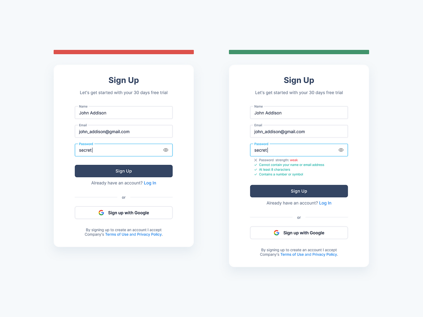
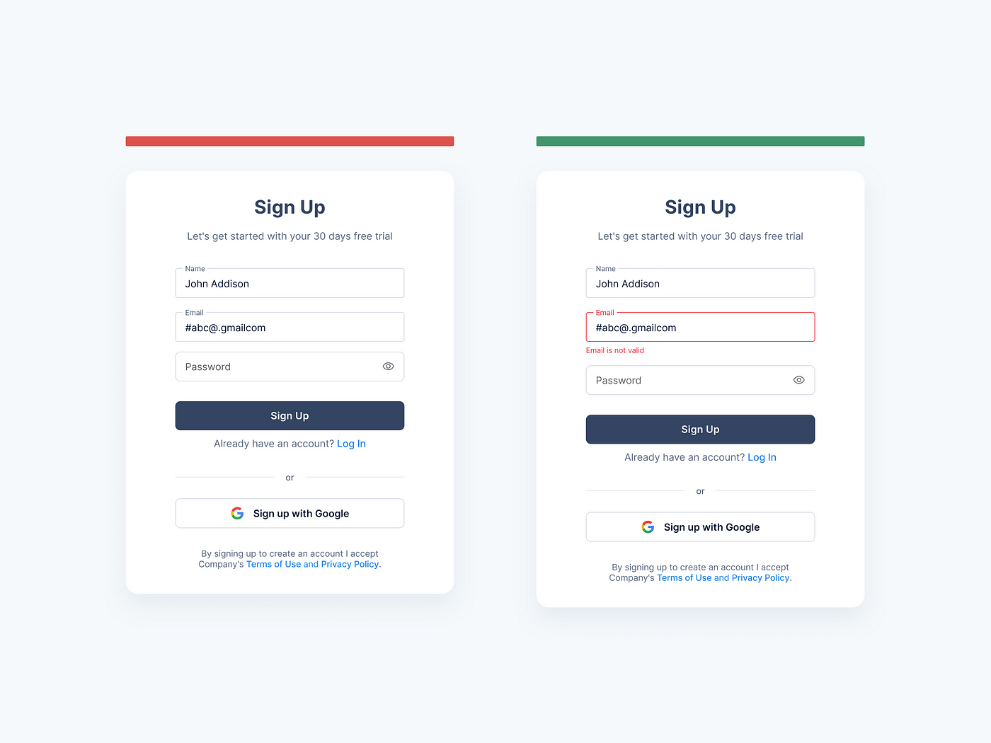
6. Provide instant input validation.
Instant input validation is a way to increase the usability of your sign-up and login pages. The users do not have to wait to submit the form to see any errors that need their attention. Instant validation helps them easily relate the feedback with the input they have just provided and they can correct it in no time. Rather than waiting for the user to fill out the entire form before you point out any errors, let them know as soon as your system can tell there’s an error. There are a few important factors to remember while providing a useful instant validation. Display the message only when the user just left the input field. A positive error message helps the user build their trust in your product. Also, the error message should explain well about the problem and how to resolve it.
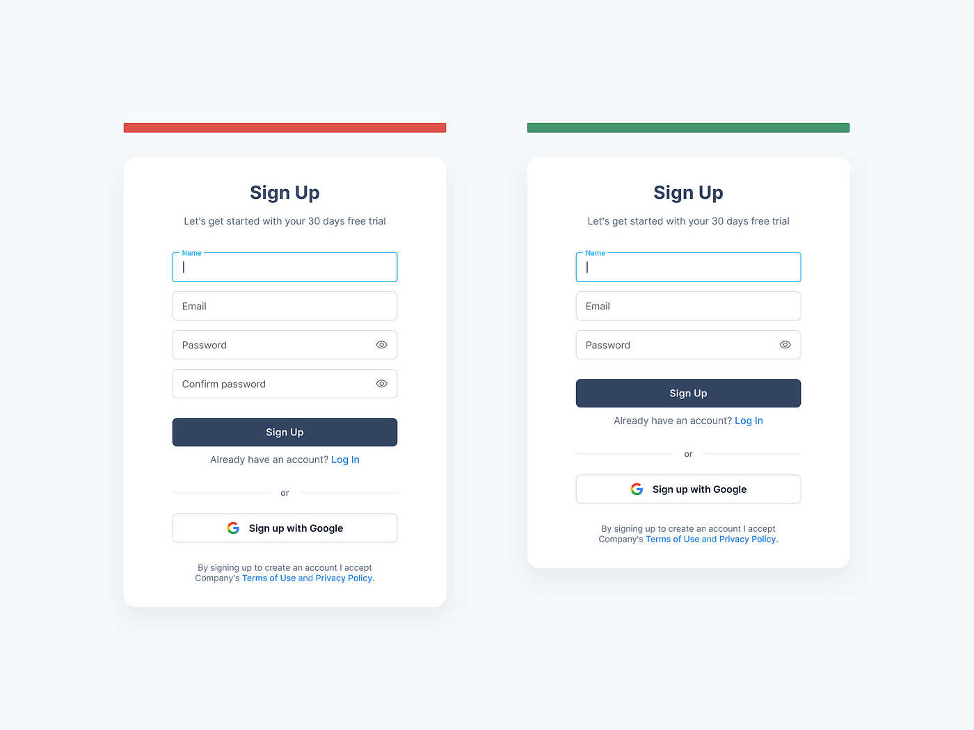
7. Don’t ask for password confirmation.
Apparently, it seems that the Confirm Password field helps users to avoid the chance of misspelling their password while signing up for the application. However, it decreases the sign-up form conversion rate.
The process involves several steps. Entering a password the first time, then entering it a second time, if it does not match the system will prompt an error. They should remove both passwords and re-type, them again without any clue. The process can repeat itself multiple times, hence increasing users’ frustration.
A better solution that is quick as well as efficient is to provide a Show Password option with the Password field. The users can click the option, see the password they are entering, and hence make instant corrections if required.
8. Use the related button label
A common practice to provide a good user experience is to use the button label according to the action the user will perform while clicking that button. The button label should always define its purpose on the screen.
Providing a generic button will make it difficult for the user to relate it with the action and there is a chance that they will forget what they actually want to do on the screen.

9. Allow switching between login and sign-up.
The user should be able to switch between login and sign-up forms when they reach your site or app. Provide an easy way to find the Login when the user is on the Sign-up page and Sign-up when the user is on the Login page. Both new and existing users will come to your site, so there is always a chance to switch between the two. It will give an annoying experience to the users if they are unable to find the sign-up on a login page or vice versa.

10. Use different terms for “sign in” and “sign up”.
Don’t confuse users by placing the words “sign up” and “sign in” side-by-side. Since they’re similar, there’s often a mix-up about which to use and when. Use different terms for each page so that users can easily differentiate between the two actions. For example, instead of saying “Sign In,” say “Login.” Consider using other terms like “register,” or longer words like “create an account.” This makes it clear that each step is different and needs to be taken in an order to continue using your product: first, sign in; then sign up.
A good design starts with a text, and a good form starts with a title. Short and smart CTA shows users the benefits of completing this form and motivates them as well. For trustworthiness, show that the user’s information is secured, and provide security badges. Offering an incentive is a great way to get people to sign-up. Research shows that when you offer an incentive, you can increase your sign-up conversion rate by up to 15%. [Resource] Instead of just asking the user to sign up, offer them an incentive that would make them want to give you their email. These incentives can be anything that you know would be valuable to the user.
Conclusion
In this article, we have given you the best practices for designing a sign-up and login page. But you always need to pay attention to suit your needs based on your audience and project goals. The more effort you put into your sign-up, and login pages, the more likely users will feel motivated to sign up and log in.
So you must create an engaging and accessible experience for your users throughout their onboarding process. If they’re having problems, you must guide them through the process. Some things to keep in mind are creating a user-friendly sign-up process and being transparent about your sign-up process.
I hope you find this article helpful.


